Autocomplete and other product micro-interactions that have become the norm
A look into autocomplete, its history at Google, and other "micro-interactions" that make the world go round.
Today we’re talking about autocomplete, its history at Google and the “micro-interactions” that have become technical norms.
the history of Google’s autocomplete
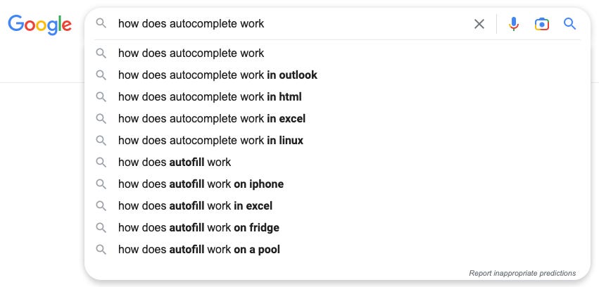
You know this screen, you’ve seen it before. Entering a search into Google’s search bar starts with a few words, but before you’ve even finished your own thought, Google’s got options for it thinks you’re planning on searching.
As reported by Liz Gannes in her 2013 article, a junior software engineer had an idea for what he wanted to call “Google Complete”. Kevin Gibbs, who is credited with building the tool, spend bus rides shuttling between San Francisco and Mountain View working on projects outside of his day to day role in systems infrastructure. He started with building a URL predictor that searched Google’s “immense corpus of Web content” to predict the website a user was looking for, then was motivated to improve elsewhere after a co-worker asked him, “What if you did it for search?”
The name didn’t stick but the project sure did. In 2004, Google Suggest was launched.
how does autocomplete work for search?
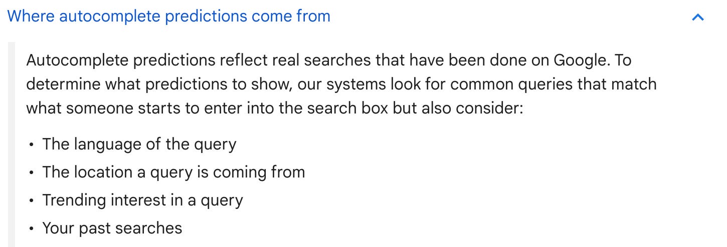
Google’s autocomplete predictions today “reflect real searches that have been done on Google”. Considering features such as “the language of the query, the location a query is coming from, trending interest in a query”, and the user’s past searches, Google suggests the top recommendations to complete your query and populate your search bar.
In an article from Google’s blog, Danny Sullivan writes that these are truly “predictions” not “suggestions” (Google Complete arguably would have been a better name). They are predicting what the user is intending to type, not suggesting a new avenue their search could go down. Google makes these predictions by breaking down the characters you’ve entered and using the data points mentioned above to predict what is the most likely phrase that you are looking up. Each new character you type generates new predictions. By now, Google must have a dataset of millions of queries that users have searched in the years since their launch. Google can use these queries as the predicted queries, as well as generate new potential queries based on phrase completion and context-based algorithms.
In a fun video with Google Autocomplete team members completing Wired’s famous autocomplete style Youtube videos, “Why is Google autocomplete weird?” is answered by the engineers — “People are weird”.
Google Suggest is born
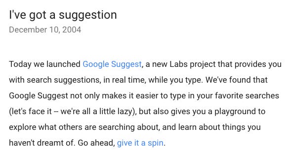
December 10, 2004, a press release announced the launch of Google Suggest which “provides you with search suggestions, in real time, while you type”.
The feature wasn’t made a default in Google products like Maps, mobile and browsers until 2008, when the feature “graduated” from Google’s lab program.
Now, a search bar without autocomplete truly feels unnatural.
The microinteractions around us
Designer Dan Saffer wrote the book Microinteractions in 2013, which discussed these tools, like Google Suggest, that have become so inherently expected among products. Fun fact — Dan also coined the term “topless meetings”, meaning a meeting without laptops, which was a finalist for Oxford Dictionary’s Word of the Year in 2008.
As defined by Saffer, microinteractions are “contained product moments that revolve around a single use case—they have one main task”. A microinteraction has been built right if “you wonder why things that don’t have it are broken, and you only notice it when it messes up.”
Some examples of microinteractions include:
Autocomplete
This article should have made you aware of this one.
Autocorrect
Read Wired’s dive into the history of autocorrect here.
Copy and paste
Command C, command V, without it how does one do anything?
The hamburger icon
What’s this you may ask? Those three horizontal lines on top of each other that always designate a website’s menu. The designer Norm Cox shared that "we used to tell potential users that the image was an "air vent" to keep the window cool. It usually got a chuckle, and made the mark much more memorable.”
Pull to refresh
The gesture was designed by Loren Brichter for Tweetie in an attempt to not take up “valuable real estate” in the toolbar.
These features, despite being small, make or break a user’s experience. Especially with the rise of mobile phones and the applications on them, users are developing muscle memory with product interactions that enable them to move fast, work seamlessly, and understand new products quicker than ever.
One way to encourage user adoption in an application (whether web or mobile) is by promoting user empowerment and engagement. When user’s feel that a website works as they want it to and that it’s enjoyable to click around, discover new things, and spend time within the website, they’re more likely to buy into continued use of the website. There are methods to test how “enjoyable” a design is, including observing a user’s body language during testing sessions to see how disgruntled they look, or don’t look, navigating an app.
If you’re developing a new application, be sure to integrate microinteractions into the design, making it as easy as possible for your users to feel empowered and engaged as they experience your application for the first time, and every time thereafter.
Gibbs was quoted saying, “I don’t feel when I look at a search box that it’s something I did, it feels like this is just how the world’s supposed to work. I don’t feel any personal attachment to it unless I stop to think about it.”


