A tale of two sprawling cities - using data to better understand how our streets keep us connected
Are Copenhagen and New York a lot more similar than I think? A deep dive on the connectedness of our cities, down to the street.
Welcome to Day to Data - a dose of musings by a data scientist turned early-stage VC, breaking down technical topics and themes in data science, artificial intelligence, and more. Check out the last piece here. New post every other Sunday.
Hello from Copenhagen! If I’m keeping myself honest, I’m a week late on getting out a new article, but for good reason - last weekend, I raced my first half marathon! Turns out half marathons are a whole different beast then the marathon, so still lots of work to do for the next one, but a fun day nonetheless.
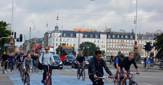
Today, I’m writing in from across the globe in a new city for me - Copenhagen! This city is quaint, full of colorful architecture, incredibly walkable and very hygge. But perhaps the most notable thing about Copenhagen is just how well designed the city is. It’s easy and safe to bike, thanks to dedicated bike lanes on every street. The metro, which opened in 2002, is easy to navigate and incredibly clean. The metro cars in the City ring are even driverless! And an estimated 62% of the Copenhagen population commutes via bike every day.
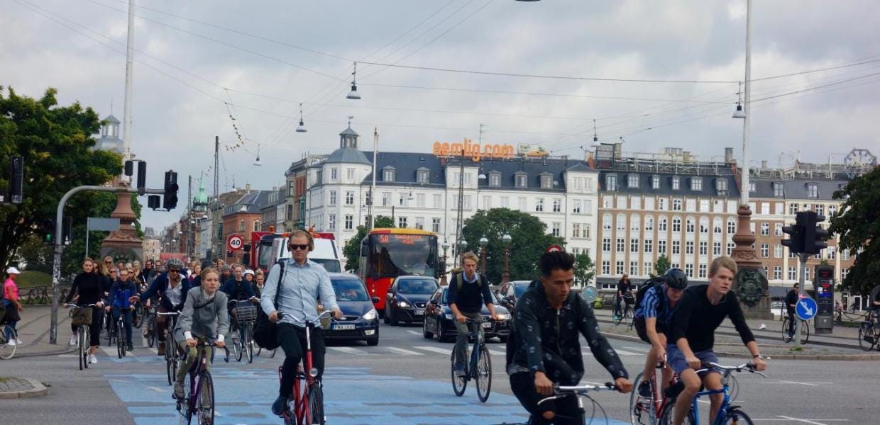
Being in Copenhagen got me thinking - where can we use data to better understand and optimize our cities? How do our cities affect how connected we are? How does a city like my home of New York compare to others? For today’s Day to Data, we’re exploring one research team’s mission to use data to better answer these questions.
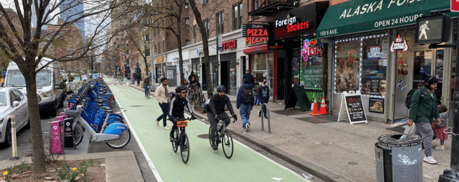
Defining the connectivity of our streets
In 2020, Adam Millard-Ball and Chris Barrington-Leigh wanted to come up with a metric to measure how “disconnected” the streets of various cities were. They focused on sprawl, which was a measure of this connectivity. Their resulting metric was SNDi — street network disconnectedness index. A mouthful, I know!
We measure sprawl through the connectivity of the streets. Sprawl is characterized by poorly connected streets – a maze of cul-de-sacs and loops, where people are dependent on private cars. Well-connected streets – like New York City’s grid – are more walkable and can be served by public transit.
Streets and streets of data
As most research does, they needed data to start. So what data was required?
OpenStreetMap — you can find the open global map here
Satellite-derived time series data of urbanization — researchers have used satellite imagery to measure the speed of urbanization
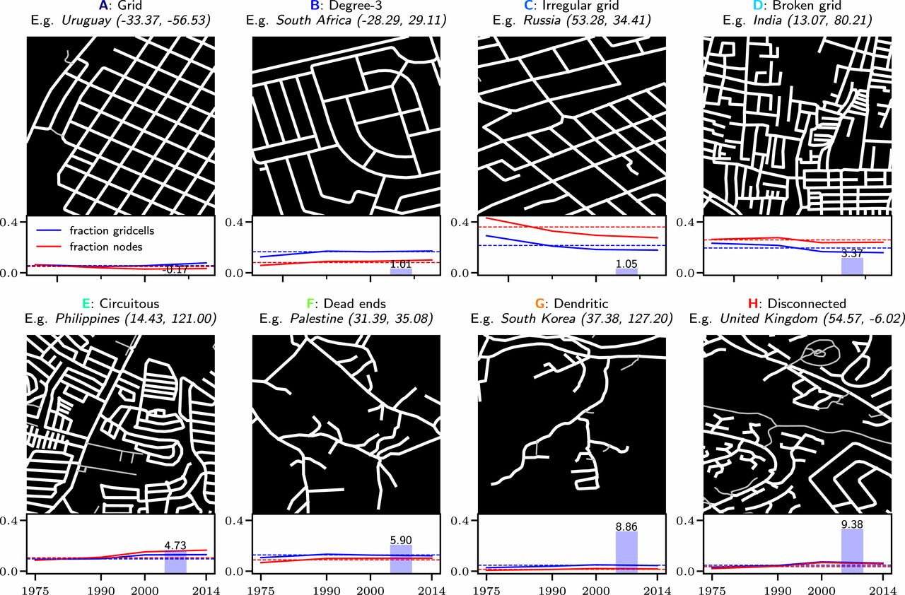
Using this data, they identified, down to the street level, how connected cities were. They classified an area into 1 of 8 degrees of “connectedness”, shown below, as defined by characteristics of being circuitous, having dead ends, or being grid like. They also did this classification over time, seeing how cities evolved from 1975 to 2020.
From Lagos to Los Angeles, the world continues to sprawl
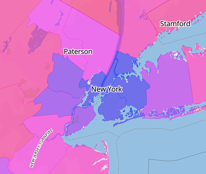
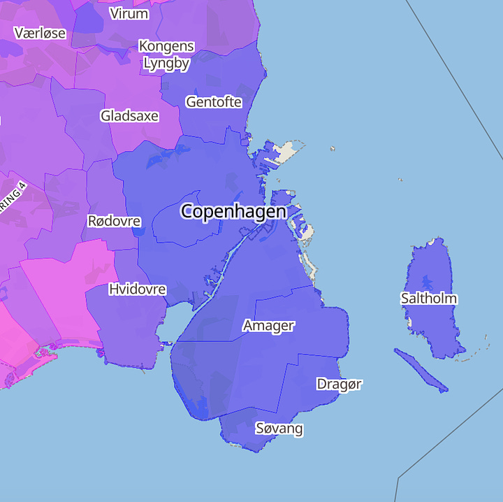
And with these findings, the research team created an interactive map of the world colored with the SNDi index, which you can explore here. My first instinct was to see how Copenhagen and New York City compared - they’re actually much closer than I thought! The blue regions on the map are lower values of SNDi, which means more highly connected regions. The red regions, really only seen on the left map below, are highly disconnected regions.
Some of the interesting findings from the team included:
Streets in new developments in 90% of the 134 most populous countries have become less connected since 1975, while just 29% show an improving trend since 2000. The same period saw a near doubling in the relative frequency of a street-network type characterized by high circuity, typical of gated communities.
Grids (type A) are the most self-evidently connected type. In the pre-1975 period, North America and Latin America were home to the highest proportions of type A (grid), at 9% and 13%, respectively. Since then, grids have declined in importance in Latin America and almost disappeared entirely in recent North American development, with that decline only partially offset by a marked upswing in the East Asia and Pacific region.
In terms of which cities had the most sprawl? Sprawl has “increased in many of the “usual suspects” such as São Paulo, Los Angeles, and Lagos”, but there are sprawling cities that receive much less attention, mostly found in southeast Asia.
And for a last bit of learnings from the researchers, they shared the diversity of ways in which street networks can grow in a connected or less connected pattern:
Gridded street networks are a primary means through which Latin American countries such as Bolivia, Argentina, and Peru have maintained their high levels of connectivity—and the move away from the grid characterizes sprawl in large Brazilian cities such as São Paulo. However, Japan has maintained low levels of sprawl via a more organic, irregular grid pattern. Northern European countries such as Germany, Denmark, and the United Kingdom, meanwhile, have maintained moderate levels of street connectivity through dedicated pedestrian and bicycle pathways, meaning that the network for nonmotorized travel is far more connected than that for cars and trucks.
This all said, connectedness alone doesn’t define how easy our cities are to get around and how accessible they are to everyone in a given population. New York and Copenhagen, both highly connected cities, couldn’t be more different! I’ll have to bring an expert in the world of urban planning and data science into a future article to truly dive into the intricacies of what make these special, highly connected cities hum!
For more on where data science meets urban planning
There’s an entire online course created by one of the researchers on this work, Adam Millard-Ball, who is currently a professor of urban planning at none other than my alma mater, UCLA! Go Bruins!
This course covers a variety of areas at the crossroads of urban planning and data science, from building ML models using scraped apartment data on Craigslist, to performing spatial relations analysis using geopandas. The swath of resources this course provides provides a substantial (and free!) foundation to more learnings on data science and urban planning. Open-sourcing this education and much of the data Millard-Ball has used in his work hopefully accelerates the findings of ways to improve our world - from city streets to beyond. Happy learning!
All block quotes are from the research team’s article here.
Thanks for tuning in! See you back here in two weeks. If you’ve been enjoying Day to Data, let a friend know! If you have any thoughts on today’s article, you can find me on Twitter/X at @gabyllorenzi.



Good show. Now all I need to do is avoid dust hour in Harrison.
The thing that strikes me most is regardless of the similarities one might find between Copenhagen and NYC, what is truly striking is the differences in populations, geography, size and diversity/homogeneity of the two countries. Copenhagen seems more like Singapore, almost a city-state, at the tip of a country, ie, Malaysia and Denmark.